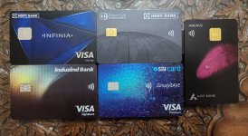
The worst card, quality wise, I have is Indusind Legend. The PVC material is thinner than all the other cards and bends easily. The print quality is pixelated. I might print a better card from local shop.
The best quality card, I own, is HDFC Bank Infinia Metal. It has considerable heft and feels solid. The print quality is also excellent with etched name and card number. I would have preferred better colours but it looks better in person than in photos. Due to its weight and feel, whenever handing it out for payments it almost always gets a second look.
I had HDFC Bank DCB previously in the completely black avatar. Though the material thickness was normal, the card being all black, looked super cool. If ever launched in metal version and same color scheme, this would be one of the coolest looking cards.
Axis Bank Magnus has the best design out of all the cards I have currently. The metal is thinner than the Infinia, but the black card with purple feather design looks very elegant. The print quality is top notch. Vertical card design also makes it stand out.
The last in the list is SBI Simply Save, which is with least limit but is the second best design out of cards I own currently. The irradiant blue mandala type design is quite intricate with rupee symbols and looks premium.
Would like others to chip in with photos and views about designs of their cards.


