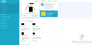
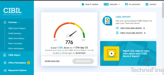
Having logged into my CIBIL dashboard, I was surprised to see the refreshed & the new look. The archaic look has been refreshed with a brand new & a crisp looking UI. Practicality and new features have been added now.
Now all the "Active" accounts are clubbed together at the top of the account summary section (No more searching for open & closed accounts), while the "Closed" accounts have been clubbed together underneath the "Active accounts", this is a saviour, especially for people with lots of credit accounts.
Also a new "repayment options" tab has been added, which shows accounts that could be negatively affecting the CIBIL score (Not sure how TransUnion will operate that or if they plan to make it a chargeable service in the future).
The tabs felt easier to navigate with the refreshed UI & with easy to locate tabs for market place, alerts, plan upgrade options and more. This enhances the user experience IMO.
To sum it up, though some might find these changes "old wine in a new bottle", which to an extent it is, but some of the new features like clubbing the "active" accounts together was long missed and much needed especially for people who have lot of credit accounts or upgrade / downgrade cards frequently as banks sometimes just don’t close the old accounts unless escalated.
This UI refresh was long overdue as checking the Cibil report even in free services like Gpay was easier because of its simple, crisp yet interactive UI ! Hopefully TU will squash any bug in the near future.
So, this was just my take on how the new refreshed Cibil interface looked & felt. I have also added a screenshot of the new dashboard with this post.
Let me know what you guys think 🙂
Attachments
Last edited:


