Navigation
Install the app
How to install the app on iOS
Follow along with the video below to see how to install our site as a web app on your home screen.
Note: This feature may not be available in some browsers.
More options
Style variation
-
Hey there! Welcome to TFC! View fewer ads on the website just by signing up on TF Community.
You are using an out of date browser. It may not display this or other websites correctly.
You should upgrade or use an alternative browser.
You should upgrade or use an alternative browser.
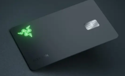
Does anyone know what this new Kotak LED card means ?
- Thread starter plastikman
- Start date
Wow...aisa bhi hota hai 😀Something like IndusInd next?
ankushanup1
TF Select
it's a light illumanating via led on transactions
they have even a texture debit card and a metal debit card
As usual with an unmatched kotak rewards and Features with bonus offer of Kotak customer care thrown in 🤣🤣
they have even a texture debit card and a metal debit card
As usual with an unmatched kotak rewards and Features with bonus offer of Kotak customer care thrown in 🤣🤣
interesting, credit card world is getting more complicated 🙂
Scenes at Kotak office:
Management: What is the USP of the card?
Product Team: Sir isme light hai
M: And what about the offers, rewards and other benefits? And how is this different from what Indus-Jhund bank already has?
PT: But sir isme light hai and we will be using a better quality LED
M: How is this of a value to a customer?
PT: Vo toh nhi pata. Aise hi, sexy lag rha tha.
😛
Last edited:
If you see like that, even Metal card has no additional value. Infact makes your wallet a bit heavier only. Just for premiumness. Every bank is thinking of a new way to differentiate.
There are customers for everything
There are customers for everything
There will hardly be people who'll get a card just for the aesthetics. If OneCard charged an annual fee on their card, their will not be any takers for it. People apply for it only out of curiosity. For Magnus or Amex Plat, people get it for the overall value it provides. Metal card is just a small bonus.If you see like that, even Metal card has no additional value. Infact makes your wallet a bit heavier only. Just for premiumness. Every bank is thinking of a new way to differentiate.
There are customers for everything
I take cards mostly for aesthetics 😀There will hardly be people who'll get a card just for the aesthetics. If OneCard charged an annual fee on their card, their will not be any takers for it. People apply for it only out of curiosity. For Magnus or Amex Plat, people get it for the overall value it provides. Metal card is just a small bonus.
@Walter White Already proving you wrong. 😂 People may not pay for aesthetics but if it is a LTF card, people will get it for the novelty and if you have it, you may end up using it sometimesI take cards mostly for aesthetics 😀
Just because of Zenith ugliness , I was trying hard to get any other variant but zenith .I take cards mostly for aesthetics 😀
But swipe up kept showing Zenith to me , finally had to take it .
Now will close it next week just because the card is so so ugly
Yeah, I also agree. Premium cards should look premium as well. Now a days, card details and name aren't even embossed with raised characters they just look laser enscribed like the mire common APay card. I liked the red accent around the HSBC card with the holographic lion. It is old but classic. Pretty useless card except for some offers but looks good 😀I take cards mostly for aesthetics 😀
AbsolutelyYeah, I also agree. Premium cards should look premium as well. Now a days, card details and name aren't even embossed with raised characters they just look laser enscribed like the mire common APay card. I liked the red accent around the HSBC card with the holographic lion. It is old but classic. Pretty useless card except for some offers but looks good 😀
Credit cards are swag .
creditbdsm
TF Buzz
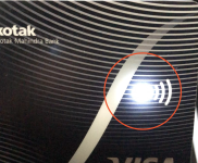
I happen to have the LED card, its a small flash of light while making tap payments.
If interested I can make a video to post here.
If interested I can make a video to post here.
That would be nice if it is not a bother for you 🙂I happen to have the LED card, its a small flash of light while making tap payments.
If interested I can make a video to post here.
creditbdsm
TF Buzz
Here..
Video of the Light blinking -
https://media.giphy.com/media/v1.Y2...zX2dpZklkJmN0PWc/idx3C6LzBNz7fLeXoF/giphy.gif
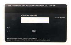
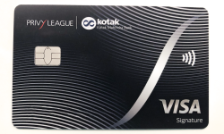
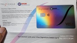
Some Photos


Video of the Light blinking -
https://media.giphy.com/media/v1.Y2...zX2dpZklkJmN0PWc/idx3C6LzBNz7fLeXoF/giphy.gif
Some Photos
