• Hey there! Welcome to TFC! View fewer ads on the website just by signing up on TF Community.

Dark mode is now available!

Two main issues iv observed so far..
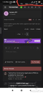
In dark mode it's a little difficult to see the unread post versus the read post since the bold doesn't show very well.
Another issue is that the bell icon doesn't retain the number (of notification) after the page completes loading. It number shows for a second and then disappears. It's like there are not notification if you don't watch the bell icon when the page loads. But when you click on the bell, you get to see the notification marked by the dot.
 
The position of theme switch button (in between alert and latest post) is very inconvenient. Theme switch button is not for frequent use. So I think it'll be better if it can be moved in between profile and message button. Think about it @TechnoFino and mods
 
I am using chrome app in iOS. If I open a menu by clicking any icon like the notification or dark mode button, the page starts to auto-scroll downwards. Hope these bugs are fixed for a better user experience.
 
@TechnoFino I think we need a thread for troubleshooting where we can post all issues noticed after yesterday update.

Another issue iv noticed is that "some" images open larger than the screen size and the top tool bar goes out of the screen. It's difficult to close the image by clicking on the x after it's expanded.. see screenshot
 

Attachments

  • IMG_20240706_131627.jpg
    IMG_20240706_131627.jpg
    157.7 KB · Views: 6
@TechnoFino I think we need a thread for troubleshooting where we can post all issues noticed after yesterday update.

Another issue iv noticed is that "some" images open larger than the screen size and the top tool bar goes out of the screen. It's difficult to close the image by clicking on the x after it's expanded.. see screenshot
Yes I too experienced this yesterday @TechnoFino
 
TF is just using the platform. I agree that there should be a dedicated section to report the issues which can be submitted to the developers.

1720252730535.png
 
Please remove the new post icon and add the search button there or remove the new posts button and replace it with search. Two places new posts is wastage of layout.
 

Attachments

  • Screenshot_20240706_151204_DuckDuckGo.jpg
    Screenshot_20240706_151204_DuckDuckGo.jpg
    193.9 KB · Views: 6
The position of theme switch button (in between alert and latest post) is very inconvenient. Theme switch button is not for frequent use. So I think it'll be better if it can be moved in between profile and message button. Think about it @TechnoFino and mods
Thanks for removing theme toggle button from top.
 
Back
Top